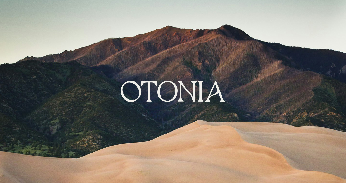
Shaping Otonia’s brand platform to inspire sustainablegrowth through an inclusive, mindful design — nurturing a community where body, mind, & nature are in harmony.
Branding / Webdesign
Brand platform
A brand rooted in clarity and care. In a world where wellbeing can feel fragmented and overwhelming, we shaped Otonia with a calm, confident voice — welcoming individuals to reconnect with themselves, their bodies, and the natural world. A grounded platform, designed to inspire balance, trust, and mindful growth.
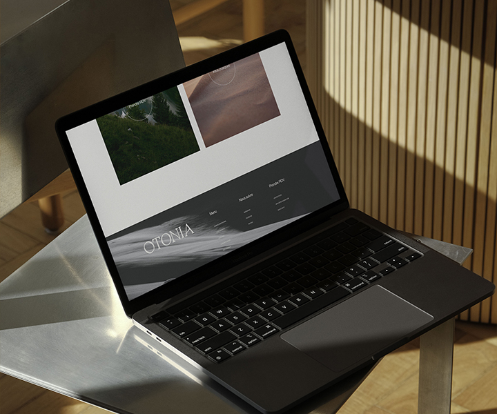
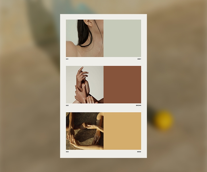
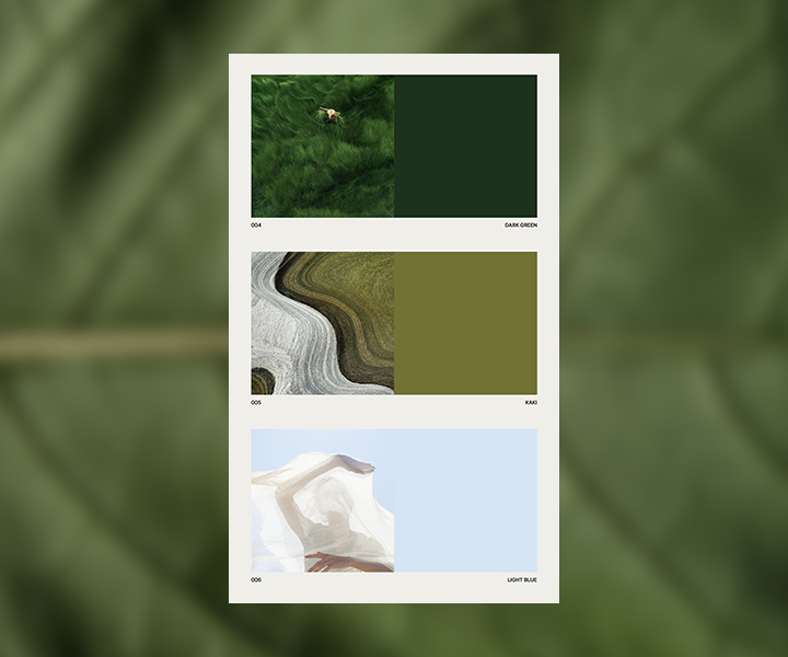
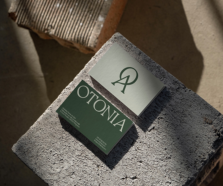
Visual identity
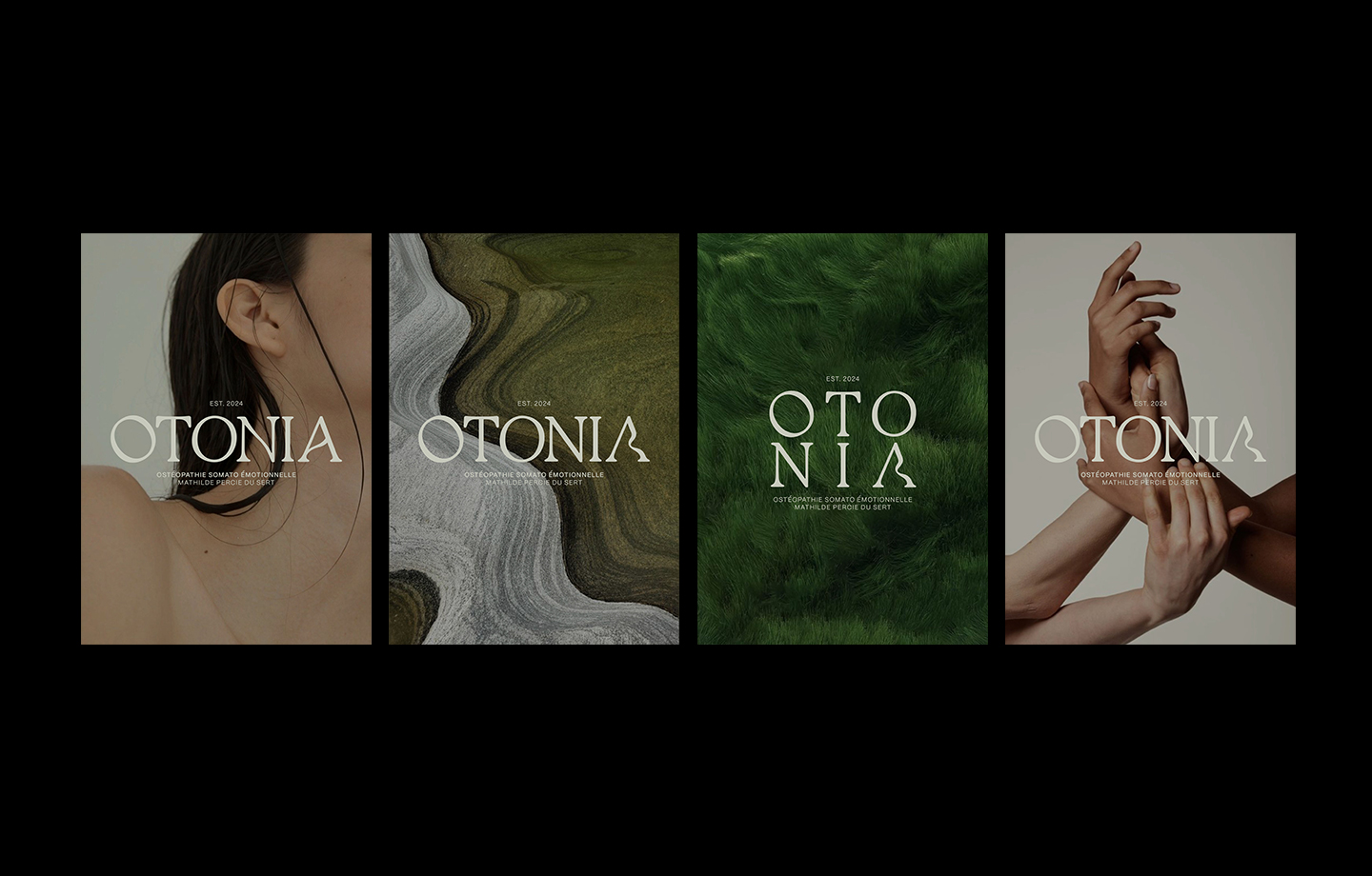
We brought Otonia’s vision to life with a palette of natural tones — soft earths, gentle greens, warm skin tones — to mirror the connection between body, mind, and nature. Authentic glimpses of people moving, breathing, living fully. A clean, organic typography and a flowing, open layout create a visual language that feels nurturing, luminous, and alive.
The Otonia logo was crafted as a symbol of harmony — simple, fluid, and rooted. Its soft curves and balanced form echo the natural rhythms of the body and the earth. Designed to feel both grounded and light, the logo embodies the essence of wellbeing: strength without force, movement without rush.
Pink House Studio - All rights reserved - 2024 This website is cleaner than 93% of websites. Only 0.08 g of CO2 is produced every time someone visits this web page.